This is a version of an essay published in Stan Brakhage the Realm Buster (John Libbey press, 2018, isbn: 978-0861967285. The printed version carries an error on page 4 that I have corrected here.
“The speed of fade and the time length of the black reminds us that movies aren’t moving pictures only: structurally, they’re time-based graphics (like a black screen), some of which aren’t pictures at all”1.
“Black has the specific quality of being only ever virtual. Natural luster, imperfect pigments, ambient light, and neighboring colours all inflect surfaces we perceive as black: achieving solid, lasting blacks takes considerable effort, the more so the more we deal with screen media that either reflect or emit light as the basis of their working” 2.
“There is metaphysical pressure to keep the contribution of shadows ‘off the books’. Philosophers and physicists alike have a strong conviction that reality is positive. They think a negative statement such as “There is a permanent absence of light in the Shackleton crater” is really about where light is rather than where it is not…(they) are uncomfortable with absences and so gerrymander discussion to disenfranchise black shadows, black space and the black sky of the lunar day”3.
The ideas for this essay have their origins in an earlier piece on Brakhage’s Roman Numeral Series4, which touched briefly on the various ways Brakhage used black in those films. Subsequently the work was developed, rather haphazardly, in the presentation at Birkbeck, of which this essay is a refinement. In a lot of thinking on the topic, black is conceived as negative, as an impure absence, but my aim here is to show how the blacks in Brakhage’s films, while they are literally areas of apparent absence of light, or at least relatively reduced absences i.e., they can be construed as ‘negative’ in this strict sense, they are also, or also function, positively, in imagistic, graphic and structural terms. For painters, black is conceived of as a colour, something that is evident in its availability in a variety of shades with exotic names: Lamp, Ivory, Mars etc. These pigments reflect varying quantities of light, and each has a colour-cast, i.e., is impure. A truly black black, one that would absorb almost all of the light cast upon it, exists. Vantablack absorbs 99.96% of light.5 Unlike the paints and the film blacks described by Sean Cubitt above, which are subject to the influence of ambient light among other things, Vantablack absorbs everything, and this puts it strangely out of balance with other elements when it is combined to make a painting or other kind of image, because it falls so far outside the typical contrast ratios of a painting or a photographic image of the World.
Black, and the shadows with which it is often associated, have a curious status in film. Notably in Films Noir, shadows are often completely solid, which is almost never the case in perceptions of the real world, where the eye can peer into relatively solid blacks and adjust to differentiate detail and variety of density. Shadows in Film Noir have a quasi-autonomous compositional function and thus become a structural part of the image, imparting a degree of abstraction to what is otherwise a representation, but this is rare in cinema generally.

Cat People, Jacques Tourneur, 1946.
Whereas black in a painting is a reflective coloured surface, and is what it is in its literal material sense, in the celluloid filmstrip it has a curious double status. At the point of image formation, ‘black’ is simply the area of the film where light registers strongly on the film’s light-sensitive surface. Materially it is an area of density (silver halide crystals that have been blackened by light) that holds back that light in projection, so is in a sense a refusal or interruption thereof, while at the level of the image it is, paradoxically, a representation of the (relative) absence of light, i.e., shadow or darkness. More precisely, it defines an area where there would be visible things had there been enough light when the image was made. Yet insofar as this absence impinges upon other areas of the frame contents, it becomes part of the image’s form: it takes up space in the frame. Furthermore its density means that it is often stronger –denser- than other parts of the image that in its pro-filmic would be materially more substantial: the image of a shadow cast by a tree may be stronger than that of the tree itself.
The question of whether black is an image is also dependent on the specificities of a film and how it is conceived. Films like Peter Kubelka’s Arnulf Rainer (1960) and especially Tony Conrad’s The Flicker (1966), which are composed of wholly black or white frames, are conceived as imageless, because the intention is to create patterns of light interruptions, structured from the presence and absence of light on the screen. In the case of The Flicker this was achieved by exposing the film to light with a lens-less camera, and by taking frames with the lens cover on for the white and black frames respectively. The filmmaker Bruce McClure creates his black and white loops simply by bleaching selected frames on a strip of black leader to create the white frames, while leaving the black frames untouched. In these examples there is no intention to create an image and thus no image in the usual sense, even though the flicker stimulates hallucinatory colour patterns when the films are viewed. A selection of Brakhage’s films can be made that demonstrates all of the above, including the last category of imageless blackness, which is a feature of Passage Through: A Ritual (1990, colour, sound, 50 minutes) and which is discussed below.
The creative use of black has been a feature of Brakhage’s oeuvre, starting right from the beginning with the noirish psycho-drama The Way to Shadow Garden (1954), a high contrast black and white film that turns to negative in the second part, after its protagonist has blinded himself and become a seer. At the end of the opening shot the camera pans to settle for five seconds on the exterior of the house in which the film will unfold. Dazzling light pours from two square windows, which are framed by an entirely solid area of black, creating a simple abstract composition, something which establishes a pattern for the rest of the film, as well as, in a wider sense, Brakhage’s working against the simplistic dichotomy between representation and abstraction.


A single bare bulb is established as the film’s only apparent light source, giving us to suppose that this precarious illumination is all that’s keeping the film alive, warding off the total darkness that would otherwise ensue. At one point the camera lingers on the bulb in close up, seemingly in an effort to break with the positive meanings usually associated with light. The oppressive light momentarily threatens to obliterate the image.
The young protagonist lurches around inside the house and we see, inter alia, a framing with a black wine bottle on a table on the left side of the frame, his shadowed face on the other, thus a graphic presentation of two strongly contrasting forms of black. At the point where, having blinded himself, he staggers towards a French window and opens the doors, the composition is divided into three roughly equal vertical bands. The man is framed centrally in silhouette, bordered on either side by black. At this point the shot cuts to negative and in what were solid black borders we abruptly see previously invisible details. Where the positive part of the shot is back-lit to create a silhouette of the man, the following negative version is front-lit, revealing details in the image where there previously were none.


This framing is pre-figured earlier in the film when the camera settles momentarily on the same pair of doors, between which is a rectangle of solid black, thus a reversal of the disposition of black and white in the two shots, a move which also prefigures the later transformation into negative. A similar reversal also occurs when the windows seen from the outside in the opening shot are seen from the inside, before the protagonist desperately lowers the blinds on them.


After he has blinded himself he picks up the lamp and waves it around, causing shadows to play on the walls. He then puts down the lamp and writhes around between the lamp and a white wall, continuing the shadow play by other means.


Anticipation of the Night (1958) is the film that marks Brakhage’s transition from human-centred psychodrama to a corresponding form in which the camera replaces the figure as protagonist. It opens with the same motif as the transitional shot in Shadow Garden, but framed very differently: an illuminated threshold, bordered by black, across which the shadow of a figure passes, momentarily darkening the screen. As if to mark the transition from rectilinear framing to the more oblique angles that will figure in subsequent films, the borders of the threshold fall diagonally across the screen, fanning out in a manner that strongly evokes the conical shape of a projector’s light beam or indeed the cone of human vision.

This was the point at which Brakhage rebelled against the conservatism of conventional optics and stable points of view modeled on traditional perspective, in favour of a subjectivised vision achieved by hand holding the camera. In this sense the sequence may indicate a kind of farewell to conventional framing. The shot is repeated several times in the opening minutes, first from one angle then the opposite – not the reverse, as in narrative shot-reverse-shot grammar- but laterally inverted –mirrored, probably by flipping the negative over during the printing stages. The shot becomes a mobile movement of black within a light frame, from representation to abstraction, breaking down the distinction –which Brakhage disliked- between the two. This figure in a doorway is interspersed with compositions that contrast strongly in a formal sense, but which are made of similar stuff: sparkling points of white light on a dark ground. In both though, there is a flattening of the image through the silhouetting process, and this continues in twilight shots, filmed contra-jour from a moving car, of trees, which obliterate the slivers of evening sky. There is also a repeating pan round an object, which in effect functions as a horizontal wipe, from light to black. These shots also prefigure or anticipate (sic) the onset of night and thus black performs a precise semantic-thematic function.
As the film moves from day to night there is a form of double reversal from negative to positive and vice versa. In the first sense the trees’ obliterating the night sky is a negation through interruption (a rhythmic process that also figures the way the projector’s shutter interrupts the light at the moment when the next frame of film is pulled into the gate to be flashed onto the screen) of the illuminated scenery. These early scenes can be seen as light fields interrupted by dark movements. In the second sense there is a reversal of this field, from light to dark, against which spots of artificial light, and sometimes the moon, assert themselves uninterruptedly against the blackness of night. In their assertiveness they present as positive in a way that was not the case in the twilight part of the film.
Insofar as Wedlock House an Intercourse (1959) features figures –Brakhage and his new wife, Jane Collum- it returns in part to the early psychodramas. At the same time it is one of his blackest films, with long sections where the screen is entirely dark apart from a small point of light or a curved shape arcing through the frame, though the arcing effect is as much that of the lamp’s movement as it is the movement of any object. Brakhage makes much use of this device. As in Shadow Garden, the illumination is precarious and highly unstable, a hand-held lamp with a naked bulb and occasionally candles –raw lights- being the only apparent sources. The lamp is rhythmically waved to create flashes of bleached highlights and enveloping shadows on and of doorways, often reflected in mirrors, creating a double framing. Cigarette smoke, both frontally lit (white) and silhouetted (black) and an alarm clock, interspersed with repeated sexually explicit shots in negative, are rhythmically permutated. The film is notable for the way in which what is thematically an explicit film about young love is rendered in so highly an abstract way. The blacks are dense and solid and the fragmentary scenes emerge sporadically out of this dark. Black consistently dominates the image, immediately enveloping the momentary light flashes, so that rather than functioning as part of a differentiated pattern made from a range of grey tones, as it would in a negative of a conventional image, black and white are in battle.
As Brakhage’s career develops one can detect a gradual move towards a concentration of colour and crystalline forms, which are often expressed as highly saturated colours, both primary and prismatic, as if the more broadly distributed colour of many of the films made in the 1960s and 70s condense into small intense areas. In these works, notably films like Arabic 12 (17’, colour, silent, 1981), black becomes more like the colour described by Cubitt above, inflected and tinted by adjacent light spilling into the dark areas through refraction, reflection and lens flare.

Arabic 12
The blacks in this film are less dense and often very grainy, sometimes because the prints are blown up from Super 8 originals. Often the black grain briefly freezes to form a greyish textured surface, upon which, or seemingly within which, new colour movements develop. Although, then, the film has been reworked in an optical printer, it has the quality of an improvisation. The hand-held camera is pointed at the sun through indiscernible obstructions, through and around which light leaks into the camera in the form of prismatic flashes, lens flare, including isolated arcs, lines of intense, star-shaped colours, and curvy, deformed geometric shapes; rhomboids, rectangles and triangles, as well as less defined patches and hues, including a bluish cast that overlays the whole image at times, modifying the contrast unpredictably.
The filmmaker juggles with these elements, shifting the balance by increasing or decreasing the amount of light / colour in relation to black and by pointing the camera directly and indirectly at the light source. The object causing the blackness isn’t itself black, but a blue something that most of the time is held too close to the lens for light to reach it. However it more often than not appears black. It has a kind of double status: any object will appear black when it’s under-lit, as is the case here, but it also generates blackness by blocking the light to the camera, thereby depriving itself of light. The moving colour shapes also have movement occurring within them in the form of animated texture, and this texture impinges on the notional black surface too, so that its own colour changes. There’s a gesture to Goethe’s colour phenomenology, in which the prismatic colours arise in the interaction between white and black, which is appropriate because black here does appear to contain and juggle many colours. It is chromatically mutable, assuming surrounding colour-shapes, squeezing and dispersing, intensifying and darkening them, catalyzing an endless succession of transitory phenomena. Throughout the film there are freezes, at which point the black becomes a static, textured grey field. Almost immediately small movements begin within this field, but the freezes remind us that underpinning the image is a volatile ground of grain movement, which becomes most visible when it is seen in greyish mid-tones (grain is imperceptible in areas of pure white and black). In Paul Sharits’ Axiomatic Granularity (1973), grain is re-filmed and magnified to the point where the solidity of a plain colour field fragments into dancing crystals of grain, illuminated by the light that strikes through and around them. Thus the solidity of any given colour on a film strip, including, black, is dependent in part on the density of grain and the magnification at which it is observed.
Arabic 12 is one of Brakhage’s most restless and probing films. It is the product of an interactive interplay between hand, eye, camera body, lens, film, light and objects. The lens’s limitations and weaknesses are harnessed to generate an extensive range of optical events that also echo Goethe’s interest not only in: ‘subjectively produced colors (after images, light and dark adaptation, irradiation, colored shadows, and pressure phosphenes), but also in physical phenomena detectable qualitatively by observation of color (absorption, scattering, refraction, diffraction, polarization, and interference)’6. Refraction was crucial to Goethe’s account of colour phenomena, and Arabic 12 is replete with both refractions and diffraction in the form of prismatic fan-shapes that arise seemingly out of nothing.
At the same time as making the Arabic Numerals, Brakhage also worked on a smaller but similar series of seven films, the Roman Numerals (1978-81). Like the Arabics, they eschew the distinction between representation and abstraction. The films are ineffable -hard to write about, appropriately, given Brakhage’s concept of film as ‘moving visual thinking’, and hence antithetical or at least resistant to exegesis. As in Arabic 12, Brakhage often appears to be working with a set of elements, if not a formal system, in which parameters like focus, brightness and depth of field, and occlusions, like the unidentifiable black object of Arabic 12, are interplayed through camera movement and aperture manipulation during shooting, though in a manner more restrained and less rhetorical than in Arabic 12. Most of the films in the series are blown-up from Super8, hence the heavy grain structure generates pointillist quasi-separated colours, which are an integral part of how the films work: they are colour films in the same way that there are colour paintings (Derain, Matisse, Newmann, etc)
Roman I.
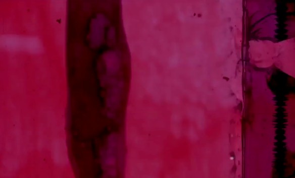
The first film (1979, 6’) has a predominant scheme of off-white through salmon pink to deepish mid-red. A camera circles over a knot of fuzzy, reddish lines. Underneath (or beyond?) these light, caressing moves, presumably lies an unidentifiable object, but it is just as easy to see this knot as a spatial array, since it is neither enclosed by a contrasting border which would locate it in a putative space, nor does it appear to be cropped by the camera’s framing. As such it has no perceptible depth but neither does it obviously lie on the picture plane. The familiar octagonal refracted image of the lens diaphragm, formed when light enters the camera directly, are rendered circular by the lack of focus, and form an integral part of the image. Could this be because the object is a light-cluster -incident light- and not an object, which would help it to harmonise with the light/lens refractions, or is it simply that defocusing blurs, literally, the distinctions between objects and light, or rather between reflected and incident light? Here are the first of the many cinematic antinomies that are dissolved in the film, between the pro-filmic and the apparatus, between conventionally wanted and unwanted optical phenomena.

Periodically, we see what appears to be a zoom, but into what? The idea of zooming supposes a final target detail in a predefined field, but when that field is already undefined -defocused- there is little against which to measure the zoom’s progress, and thus the distinction between wide and close loses its purchase. What we have in effect is a kind of reframing, or better still, a pure cinematic movement, one that is not dependent on a pre-established pro-filmic which retains itself as a function of the apparatus, but a new kind of abstract movement which progresses, or evolves, the image.
Like Arabic 12, many of the Roman Numeral films consist of prolonged shots, in which Brakhage gives himself time to establish and develop a similar juggling of elements, though the films are generally more enigmatic, less concretely and discernibly of something, and, by contrast, more luminous. Single black frames perform a variety of functions in the film. They punctuate these longer shots, and dynamise the relationship between longer and shorter ones. Because the longer shots are often very similar to each other, the black frame serves to indicate the end of one shot and the start of the next by a clear and emphatic, albeit momentary, pause. The black frames also generate rhythm, or in some cases augment an existing one. They have a mildly disruptive effect, without creating pauses, as longer sections of black would. This disruptive effect can also be seen as an anti-montage device: once shots are separated, even if only by a blink of black, montage is frustrated, the clash of the cut which generates Vertov’s essential Interval, is disabled. It’s also worth mentioning that a single frame of white would be much more disruptive than black because it’s an intrusive, dazzling flash, as opposed to a moment of darkness. Therefore, the black functions in part as a discrete but powerful punctuation mark, which inflects meaning and rhythm in the same way a comma does in a text. These punctuations energise flowing passages of what are often closely similar shots.

Roman Numeral 1
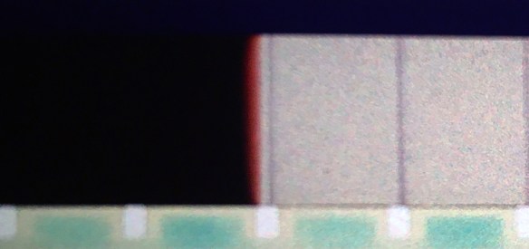
There is another way that black frames work, which contrasts with the examples given in the foregoing paragraph. It is quite often the case that the black frame is next to the over-exposed first frame of a shot (this can be seen in the frame strip from Roman 1, above). This happens because the first frame to be exposed receives more light than those that follow, because the camera is not yet running at full speed –it takes one or two frames to accelerate to 24fps, hence the first and to a much lesser extent the second are exposed for longer than subsequent frames, when the exposure time is stabilized at 1/50th of a second. This technical fact results in a visible flash when the film is viewed at normal speed, but the insertion of a black frame increases the contrast between the light and adjacent frames. By the same token this contrast also increases when the frames adjacent to the black frame are lighter.
There is one more thing to say about the insertion of single black frames between shots. If two pieces of negative are joined together using a cement join, the splice is highly visible when it’s printed, as the edges of the film overlap each other within the frame area. A simple and economical way to avoid this is to insert a frame of clear film between the two shots, which becomes black when the negative is printed. It’s also cheaper to do this than to use the special methods required to create invisible cuts, because laboratories charge less for printing from a single roll of negative. It’s quite possible that this was Brakhage’s reason for using this technique, but in any case it’s a good example of an economic necessity generating aesthetic effects, in the same way that financial constraints often prompted production of the many films he made by working directly onto the film strip without a camera.

Roman V
V (1980, 2’ 36”) has a roughly symmetrical structure, beginning and ending with greenish dark forms, with a long stretch of black in the middle, which is spotted with warm-toned flashes of colour. We also see for the first time shapes that are apparently generated from pro-filmic objects, in other words things which don’t look only like light effects, although, as always, one cannot be entirely sure. These too are dominated by black, so that the light parts of the image are strictly isolated. The main image is a kind of eclipse-like semicircular line, which partially encloses a roundish shape in centre-frame, before dissolving away:

Roman V
Black is articulated by colour rather than the opposite, as might be imagined, with many shots that are almost entirely black. Whereas in Arabic 12 a black object is used to generate and control colour phenomena, here the colours frame and hence define the areas of black as something, by implication.

The colours in Roman VI (1980) are green, orange and pale red: not pink, but a de-saturated red. Immediately one is set to think about the relationship between hue, brightness and saturation, factors that are in turn complicated by the brightness of the projector bulb and variations in the colour temperature of white. Pinkness is a function of white being added to the mix, and which, therefore, given that white is opaque, is an opaque colour itself. But the whiteness in a film pink comes from the projector lamp shining through a certain density of redness, so how is a colour like pink even possible in film? Furthermore, opaque colours tend to look flat, that is, non-shiny and so relatively homogeneous (think of Vantablack, which is absolutely homogeneous because wholly non-reflective). Yet in films there is always an impurity of colour, and a certain depth at the grain level, since the image is a composite of coloured layers in grain, as seen in Axiomatic Granularity.
The film opens with a brilliant pulsating soft form, a warm-toned and glowing shape that hovers over a field of dense black.

There are long black pauses whose colour flare-ends fall within the frame. Thus each black stretch is announced with a momentary flash of brilliant red/yellow fringes and ends with the same, creating a kind of overhang into the next shot.
The sections of black spacing announce themselves as shots, not just pacing devices, through these colour flashes. They imply that the black has some kind of meaning beyond its rhythmic/pacing function. This may be nothing more than the intention to dramatise the contrast between black (colourless and lightless) and red-yellow (coloured and light). In this respect it relates to the single black frames in the first film. The sense of high contrast is continued within images, as opposed to between them, and the colour end fringes of the black sections are echoed in the colour fringing of actual images.
The colour fringes also generate their own optical effect, in a film of optical effects, and remind us that buried in black celluloid are colour layers which may only become visible if the emulsion is scratched into, or if the shot is fogged at its very end. Thus it is implied that black contains other colours, even if they may be be visible. They are latent, waiting be revealed, and once we understand this we can no longer think of the black as simply the absence of light or colour.

Roman VI
It is almost didactic in the way it works through a series of colour and graphic possibilities, starting with cuts between loosely complementary coloured, contrasting forms.

Roman VI
These are followed by a series of shots in which the interaction between different kinds of graphic forms and the constant tonality in the film, black, are rehearsed; slashes, a circle in lower right corner, diagonal divisions of the frame.


These different forms all imply different kinds of black and all function in a slightly different way, even though the black itself doesn’t change. It doesn’t move, but it punctuates, articulates and dramatises, as well as unifying in a thematic sense, in that all the Roman Films are unified by a dominant colour. Black forms a background in that the lighter shapes imply it as such, but insofar as there is no depth to the black it is more like the ground in a painting than a background in the photographic sense. One wants to read it illusionistically as deep space, but the urge to do this is based on assumptions, which are themselves based on conventions, not on strict observation and reflection thereon. VI can be seen as a condensed, abstract echo of Anticipation of the Night in the blance between light and black forms shifts towards the latter as the film progresses.
VII (1980, 4’ 45”) begins with what appears at first to be a TV roll bar, but it soon becomes apparent it is not: its movements are too discontinuous. It’s actually a black bar on a white ground whose position shifts arbitrarily, yet there is surely a comment on TV here.

Roman VII
Brakhage’s dislike of both broadcast TV and Video as media have nevertheless inspired some of his best films, including 23rd Psalm Branch (1966-7) and Delicacies of Molten Horror Synapse (1991), with its extraordinary ghostly grey textures and images in negative, overlaid with looped, hand painted material. In the Roman film the comment seems to be more on the violence of the electronic process by which the interlaced TV image is constructed and disseminated, a disturbing, a-rhythmic electronic emission.
Diminishing the size of a camera lens’s aperture extends the depth of field -the spatial axis between the lens and infinity- so that “stopping down” brings things into focus that were out when the aperture was wide open. Stopping down concomitantly darkens the image as progressively less light reaches the film. Brakhage makes repeated use of these principles, creating fades to near black from out of focus beginnings, so that shots come tantalisingly into focus just as they fade away. One says “fades to black”, but in fact the device as used here is not really a way of fading, more a stategy for shifting emphasis within the image, in effect altering the hierarchy of elements within the scene, or “leading the eye around”, to borrow a phrase from painting. Darker areas, of course, are the first to go, and highlights the last, so that at a certain point in a given shot, the image will shift from being a variegated, multi-coloured field, to a dark, modulated one with a constellation of soft highlights. Here it seems black is the product of a technical procedure, conjured into being as the lens aperture is closed. An image is formed at the same time as it is destroyed, at the point that most of the frame goes dark. The last fifty seconds comprise a gradual darkening of a blue ground, so that one is again led to understand that what becomes black isn’t really. It is also yet another example of the application of Goethe’s idea about blue being next to black.

Roman IX
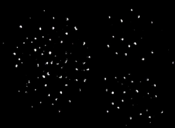
In IX, the final film in the series (1980, 1’ 40”), black spacing comes to dominate even more. The film begins with 17 seconds of black, which are interrupted by two half-second bursts of white. There is a similar vignetting process to Arabic 12 with star-like forms emerging and receding and the image of the setting sun emerging repeatedly out of a black field. The film has a “hot spot” at its centre, as if it has been re-filmed using a crude back projection system. Focus-pulls are deployed extensively, notably to change the shape of clusters of star-like highlights, which morph into horizontal bar shapes and back again, hence motion and mutation are achieved through focus pulling. An alternative approach to such cinematically created movement, that is, movement as the product of camera strategies, not pro-filmic movement, is rigourously elaborated in Wilhelm and Birgit Hein’s film Structural Studies (1970). Where the Brakhage films are restless and animated, the Hein’s is cool and methodical. It may be compared, in its taxonomical rigour, to the photographic work of Bernd and Hilla Becher, who photograph industrial buildings in a meticulously uniform manner. This is not to say that their work is not also about the apparatus in important ways, but there is a settled equilibrium in their pictures between the apparatus and its subject which in Brakhage’s films is always precarious and unstable.
In complete contrast to the restless and mutable black of Arabic 12 and the Roman Numerals is the bold and unvarying density of Passage Through: A Ritual (50’, colour, 1991), less than a minute of which has any imagery. It is one of Brakhage’s most uncompromising and experimental films. It falls far outside the terrain of the family romances, landscape studies and light plays that make up so much of his oeuvre. By contrast, Passage Through is surely the most austere and unusual film to be made by Brakhage, or indeed anyone else. It arose after he received a sound work by the composer Philip Corner: Through the Mysterious Barricades Lumen 1 (After F. Couperin), a long, minimal solo piano improvisation based on one of Francois Couperin’s most celebrated keyboard works, the rondo, Les Barricades Mysterieuse, the fifth piece in the sixth suite –Ordre– from Book Two of his Pièces de Clavecin of 1717. The piece is pitched relatively low on the keyboard, mostly in the lower register, i.e., below middle C, and this is reflected in the score, in that both hands are written for the bass clef, instead of the standard arrangement of bass clef for left hand and treble for right. This gives the work a ‘dark’ tonality compared to pieces that are more equally balanced between bass and treble. When played on the harpsichord the piece has a rich clangorous quality, which Corner’s composition replicates in pianistic terms through long sustained accumulations of notes. Couperin’s short composition (two minutes to Corner’s 40 plus) is mesmerizing in its use of rotating figures in both left and right hands, among which repeated single notes ring out insistently, and Corner’s extended version is structured around repetitions derived from the Couperin, specifically the minor second that comes at the end of the first section of the rondo and which is repeated in the final. The minor second recalls some of Morton Feldman’s later piano works, notably Palais de Mari (1986), one of his very last compositions. Corner’s composition features rolling, repeated notes in the treble, which are periodically joined by noisy clusters in the bass. The sustain pedal is held down throughout (a device also used by Feldman in his longest work for solo piano Triadic Memories (1981) which lasts at least 90 minutes). After about 33 minutes of what is often nothing more than a single note played repeatedly, we hear the whole of Couperin’s original, played at about half speed, including the last two notes that form the minor second, from which Corner’s piece then directly resumes, making explicit its derivation from its source, and accelerating for the last few minutes of the film7.
Brakhage’s film challenges what a film is, or needs to be, or to have, to qualify as such and in this sense is almost para-cinematic8, in that it raises the typical question of whether a roll of imageless black leader running through a projector is a film: what do we see when we experience such a work? There is, on the other hand, just enough visual material to secure its being as a film, assured by the presence of the very few, tantalisingly short shots dispersed throughout. The first of these, a light source partially occluded by foliage and / or some kind of mesh, filmed through an out of focus window frame, appears after several minutes and lasts just over one second. Subsequent shots of similar length flash up every few minutes until after 25 minutes we see a relatively slow and lengthy shot of a cloudy sky that fades in and out in around five seconds, followed in short succession by shots of a similar length, before returning to longer periods of black.
Insofar as there is nothing on screen for most of the time, we have the space to listen to the continuous and rhythmic soundtrack, whose repeated notes are connected by sustained drone-like tones. The inevitable division of attention occasioned by the simultaneity of sound and image in most movies, something Brakhage objected to, and which is reflected in the fact that all but about six of his 450 odd films are silent, is avoided by the same logic in this case. The situation of, in effect, listening to a piece of music in place of watching a film is arguably the most conducive possible situation for so doing, more than at a concert, where there are plenty of visual distractions. Black is the ideal colour for the film: non-symbolic, non-associative, tonally neutral, devoid of any inherent modulating or irrelevant aspects (notwithstanding, of course, the variations due to different screening venues, levels of ambient light in the space etc). Equally, black maximizes the impact of the images when they do appear, by virtue of its contrast. The images are sufficiently infrequent so that one becomes immersed in the music, then, when an image does appear it is always by surprise and has disappeared before one has had time to take stock. Only at the halfway point, where the aforementioned cluster of slightly longer shots appear in quick succession, does one begin to get the measure of things, anticipating the next shots after two or three of about six have appeared. However, this is a film, not a static image –a projected slide, for example- and so one is inevitably also always in a state of anticipation, however much this is etiolated by the scarcity and infrequency of images: something, anything, could happen. On the other hand, the black is consistently solid and unvarying, so that the question of what we are looking at and why inevitably arises. The state of anticipation gives way to absorption in the music, or perhaps the mind, and indeed the eye, wanders. One might not look at the screen yet still be absorbed in the music, which is, after all, part of the film. A film without sound is unambiguously a film and no less so for being silent. On the other hand a film with sound but no images is a much more dubious object. What is it really? One is reminded of Clement Greenberg’s statement about the minimal requirements for something to be a painting, based on his idea that flatness and its delimitation were fundamental to painting: ‘thus a stretched or tacked-up canvas already exists as a picture, though not necessarily as successful one. (The paradoxical outcome of this has been not to contract, but actually to expand, the possibilities of the pictorial)”9. Thus, like the unpainted surface of the canvas, the black of A Passage Through is intended, bears intentionality and functionality, and this is true of almost all of Brakhage’s uses of black. Black is never simply or only a pause. It always has some other function, disruptive or rhythmic, or to serve a specific graphic purpose by contrasting with or emphasizing the character of adjacent shots or frames.
Brakhage has stated that Passage Through “required the most exacting editing process ever”. It is hard to work out what this might mean, however, at least in considering it at the level of sound-image relations in terms of synchronization. The main cluster of shots, a pivotal point in effect, occurs halfway through the film, but several minutes before the recital of Couperin’s rondo, which is a corresponding point in the music, however the relationship between the sound and the images –fleeting close ups of foliage, human gestures and skies- is impossible to pin down, and surely this was intentional, since anything that even hinted at some form of synchronicity would nudge the viewer to recuperate the work as a kind of quasi-generic music video or simply a conventional ‘film’, albeit of an extreme and unusual variety.
The brevity, semi-abstraction and tentative character of the images are wholly contrasted to the transparency and literalness of the music: like Feldman’s later works, the structure is on the surface, lucid, legible and almost didactic in its workings-out, unlike a lot of complex C20 serial compositions, where recondite analytical procedures are required to uncover the organizing principles of a work, work that furthermore made a virtue of avoiding repetition, thereby frustrating the memory functions that commonly help the listener to orientate themselves. For most of the time, Passage Through does not require memory function, since there is almost nothing to remember, on account of the limited and repetitive nature of the material. However, it makes acute demands at the point where images do appear and overall on reflection, at the end: what were those images and how are they related? Is there a cumulative effect, or are they deliberately spaced far apart so as to frustrate efforts to concatenate meaning?
The inflected blacks described by Sean Cubitt in the opening quotation are ubiquitous in Brakhage’s oeuvre, but there are a few films where they are explicitly explored. In The Worm of the Cat’s Green Realm (1997), a black cat is filmed washing itself, the camera zooming in until the frame is filled with iridescent, animated fur. These shots are contrasted with close ups of saturated greenery, behind and among which lies a density of blackness. Texture has migrated from the black of the cat’s fur to that of the leaves, concomitantly shifting the kinds and effects of black from one to another and so on. Almost uniquely, Brakhage’s films, in the process of getting us to attend to the complexities of our seeing the world, as inflected by the interplay between the myriad of perceptual phenomena the films both record and stimulate and the peculiarities of the apparatus, lead to a reflection on the possibilities of black. There is a negation of the negative, so that although black is always in some way the absence of light, this absence is never absolute, invariable or reduced, even in Passage Through, where its reduced function serves a specific purpose and is in any case crucially rescued by the few short shots it contains. Rather, Brakhage is constantly working black in different ways –formal, semantic, phenomenal, metaphorical- to diversify and expand its possibilities. Black is an equal partner in so many of these films that are more usually described in terms of their light qualities.
Thanks to Emile Vergé and Fred Camper for suggesting some of the films that I would not otherwise have other known about, and to LUX, London, for kindly making their collection available for me to view.
- Durgnat, Ray, A Long Hard Look at Pyscho, London: BFI, 2003, discussing the fade to black at the end of the first part of Psycho, when Marion Crane’s car sinks into the swamp.
- Cubitt, Sean, 2014, The Practice of Light: A Genealogy of Visual Technologies from Prints to Pixels, Boston: MIT (Leonardo Book Series), p. 22.
- Sorensen, Roy: Seeing Dark Things, New York: Oxford University Press, 2008, pp 16 & 201.
- Hamlyn, Nicky, 2005, “The Roman Numeral Series”, in Stan Brakhage: Filmmaker, ed., David James, Philadelphia: Temple University Press, pp 113-128.
- Surrey Nano Systems: Vantablack: https://www.surreynanosystems.com/vantablack
- Judd, Deane B. (1970). Goethe’s Theory of Colour, Cambridge: MIT Press, p xi.
- Les Barricades Mysterieuses has been a major resource for Corner in his improvisations. He has recorded improvisations based on it several times using a variety of similar titles, in solo and collaborative versions of differing lengths.
- Paracinema, a term coined by the American filmmaker Ken Jacobs, applies to films made without film technology –cameras etc- or to works that are called ‘films’ but which aren’t in any normative sense, for example Anthony McCall’s Long Film for Ambient Light, which was simply an empty room illuminated by daylight during the day and light bulbs at night. For an evolving theorization of Paracinema, see Jonathan Walley, “The Material of Film and the Idea of Cinema: Contrasting Practices in Sixties and Seventies Avant-garde Film,” in October 103 (Winter 2003), pp 15–30 and subsequent formulations. For a detailed discussion of Walley’s evolving formulations, see Cathy Rogers: Film Outside Cinema, (MPhil, Royal College of Art, 2014).
- Greenberg, Clement, 1993: ‘After Abstract Expressionism’, in The Collected Essays volume 4: Modernism with a Vengeance, 1957-69, ed. John O’Brian, Chicago: Chicago University Press, pp 131-132.
